Scientists predict that as Earth warms and climate patterns morph in response, animals will be forced to move to survive. That usually means hightailing it to higher latitudes as equatorial areas become too hot and dry.
This movement pattern has happened fluidly and naturally in the past as climates have shifted, but now with human developments such as cities, highways and agriculture, critical animal migrations will be limited in surprising and troubling ways.
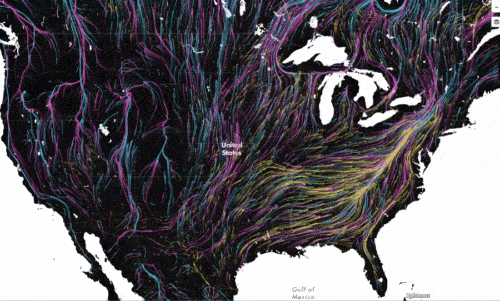
The University of Washington and The Nature Conservancy have created an animated map showing where mammals, birds and amphibians are projected to move in the Western Hemisphere in response to climate change. The visualization draws upon flow models fromelectronic circuit theory, taking inspiration from existing visualizations of wind flow across the U.S.
“This is the best visualization of any of these studies we’ve done. It’s much more compelling than our static maps,” said Joshua Lawler, a UW professor in the School of Environmental and Forest Sciences and lead author of the study informing this animated map. “The flow diagram really makes the data much more accessible.”
In 2013 Lawler, along with Julian Olden, a UW associate professor of aquatic and fishery sciences, then UW graduate student Aaron Ruesch and Brad McRae of the Conservancy, published a landmarkstudy in Ecology Letters that considered the likely movement patterns of nearly 3,000 species under climate change — determining which areas will be hot spots for animal migration in the coming decades and centuries.
In the U.S., they predict that the Appalachians will likely serve as a highway for species moving north. In the west, mountain ranges and protected areas will also serve as conduits, but many of the higher mountains will also serve as refuges themselves.
The researchers had created fixed maps showing species’ movement and patterns, but the data practically begged to be animated to visualize the full effect of the paper’s results, Lawler said. They asked data whiz Dan Majka with the Conservancy’s science team to produce an animation, and in mid-August Migrations in Motion launched.
The map is color-coded to depict separate movement patterns for mammals, birds and amphibians. The animations show a mass exodus toward northern regions, with empty black zones showing where large cities or landscape features like the Great Lakes block migration. It’s important to note that each dot and subsequent streaking line show the accumulation of species’ movement, not just one animal’s future migration, Lawler explained.
The researchers were surprised to see how clearly migration routes appeared once the data were visualized. They knew from the data that the Appalachians and the Rocky Mountains were important movement areas, but once the data were animated on a map, those routes popped out like well-trodden paths, Lawler said.
“It was shocking to see these features emerge so clearly. You can really see them when the data are visualized like this,” he said.
In South America, the most striking pattern is a projected movement of species west out of the Amazon, Lawler added.
The researchers plan to calculate migration shifts for species in the U.S., particularly in the western regions, at finer resolutions, then apply that information to find the places most important to protect for movement under climate change. They also hope to visualize that data.
Read more about Migrations in Motion on the Conservancy’s blog, and see related stories inWired, The Atlantic’s CityLab and Fast Company.


