Looking at the list of names on Waitman Beorn’s computer screen is staggering. The eye blurs almost automatically as it searches through the 18,000 people – recorded by name, approximate birthdate and address – on the list compiled by the United States Holocaust Memorial Museum. Yet, these 18,000 are only a small fraction of the nearly 160,000 Jews who were placed into forced labor or systematically murdered under the brutal Nazi rule in Lviv, Ukraine.
“It’s hard to look at this as a list and see anything but magnitude, because it’s so much data,” Beorn said, “but there’s so much rich information here for us.”
For that reason, he turned to the University of Virginia’s Scholars’ Lab for help in creating a clearer, more comprehensive way to share this data.
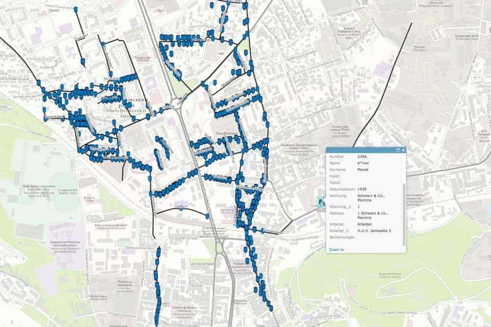
Beorn, a lecturer in UVA’s Corcoran Department of History and a consultant to the United States Holocaust Memorial Museum, has studied the Holocaust from a geographic perspective before and was looking for a way to create an interactive map of the Lviv ghetto and the nearby Janowska concentration camp.
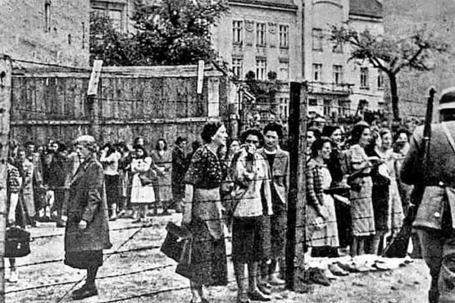
The city and the camp are an important case study for historians. Janowska was unusual as a hybrid institution that served as a forced labor camp, a transit camp for deported Polish Jews and a killing center – at least 80,000 Jews were killed there. It was also unusual for a camp like Janowska to be so close to a city and local Jewish ghetto.
All of these factors make it an important area of study for understanding how the Holocaust was perpetrated at the local level and what life was like for individual Jews suffering under Nazi rule. Beorn believes that mapping helps with that understanding.
“There is an importance simply in naming these people, but it’s also good to have a visualization of that rather than just a big list,” Beorn said. “In a certain sense, this enables us to bring things back down to the individual level and see that in this house there was a young family, or a woman who worked as a nurse.”
Earlier this fall, he brought the list to Scholars’ Lab GIS specialists Drew Macqueen and Chris Gist, who started by looking at a single city block in the Lviv ghetto to see how they might best locate each resident and tag their locations with details about them.
“Initially the plan was just to try and do a proof of concept, but we ended up communicating with folks in Lviv and were able to get some data that allowed us to create what’s called a ‘locater,’” Macqueen said. “It’s similar to when you go into Google Maps and type in an address and it gives you a point location. We were able to create a locator where we could plug in Waitman’s spreadsheet of addresses and provide point locations – a rough location for where each of these people would have lived.”
What started as a test of a single block quickly grew, and the Scholars’ Lab team has been able to plot 16,000 of the 18,000 names so far. When users click on a location point on the map, they learn about the residents there. If they click on an apartment building, for example, they can first see how many people on the list lived there and then scroll to learn more about each individual person.
Although the map is still incomplete, the primary function right now is searchability. Plotting the data in this manner makes it easier to search for residents by birthdate, job and address. This allows researchers to visualize how many people were working for a certain company, for example, exposing how these workers may have been grouped and to what extent local companies were exploiting the forced slave labor of the Jewish population.
“The next step for us then could be adding another layer of important Jewish buildings and institutions within the ghetto,” Beorn said. “This would allow us to do things like show how long it would take someone to walk from their house to that particular location.”
Learning travel times like that would give researchers a better idea of how strict Nazi-enforced curfews would have crippled everyday tasks like a long round trip to and from the grocery store.

Through the University’s Faculty Global Research with Undergraduates program, Beorn has brought on two undergraduate researchers to help him identify new data for this project and his broader study of the Holocaust in Eastern Europe. Third-year Ryan Wolfe and second-year Matt Poliakoff are helping Beorn sort through information in the National Archives and will travel to Ukraine with him during spring break to conduct further research on the ground. Wolfe, who speaks Russian, has been working to sort through data in many of the primary source documents from Ukraine.
“I’ve been really surprised to learn how many of the day-to-day jobs in these camps and all this administrative stuff was not necessarily done by Germans,” Wolfe said. “The Germans were the ones at the top and they were obviously running the occupation of this area, but a lot the people who were part of the national movement were carrying out this work and aligned themselves with the Nazis.”
Revelations like Wolfe’s are another example of how seeing data at the local and individual level can help Holocaust historians find a deeper understanding of something that happened on such a massive scale. There’s still work to be done on the Lviv project – additional names to be plotted and layers of data to add – but Beorn hopes to be able to share the map as a tool for researchers to gain this local understanding by some time next year.
“This is the level where ideology meets reality meets situation and environmental circumstances,” he said. “That’s really my approach to doing history – to try and dive into those areas and extrapolate what it can tell us about the larger phenomenon.”


