There’s a strong chance that last week’s scorching temperatures were even hotter than reported for those living in underserved urban areas.
It’s been well established that more impoverished areas within cities are typically hotter than their wealthier neighborhoods. Dubbed “urban heat islands,” these communities have more buildings, less vegetation and somewhat higher population density, which combine to produce the heating effect.
New research from environmental engineers at Duke University has shown that citizen science tools used to gauge heat in these urban areas likely understate the problem of heat islands. The researchers also suggest a statistical method to improve estimates of urban heat.
The research appeared online June 17 in the journal Environmental Science and Technology Letters.
“The poorest areas of a city also tend to have the fewest number of weather stations to pull data from, so if we’re going to rely on their data, we either need to add more ground sensors or try to adjust for the missing data,” said Zach Calhoun, a civil and environmental engineering PhD student at Duke. “While having accurate temperature data might be important for residents going on their day-to-day business, it’s especially important for policymakers relying on the data to make well-informed decisions.”
“Extreme heat also leads to poor air quality, and the resulting impacts on respiratory and cardiovascular health should be monitored for the benefit of all,” added Marily Black, public health scientist for Underwriter’s Laboratory (UL) Chemical Insights Research Institute and coauthor of the paper. “This is especially true for the vulnerable in urban areas such as children and those who are economically disadvantaged.”
This data comes from the popular weather website Weather Underground, which was founded in 1995 as an offshoot of the University of Michigan’s internet weather database. It works by pulling data not just from official government weather stations, which are relatively sparse, but from weather stations set up by citizen scientists essentially in their own backyards. Today, Weather Underground receives data from more than 250,000 of these personal weather stations. In 2012, it was acquired by The Weather Channel, which also relies on this network of private stations.
While not exorbitantly expensive, personal weather stations cost several hundred dollars each. As one might expect, they’re more commonly purchased and set up in wealthier neighborhoods than in poorer ones. And that can cause issues when relying on a large number of them for weather information.
“Some of the sensors may be a bit off, but if you put a lot of them together, the aggregate data is pretty reliable,” said Mike Bergin, the Sternberg Family Professor of Civil & Environmental Engineering at Duke. “More data is good data. And less data is bad data.”
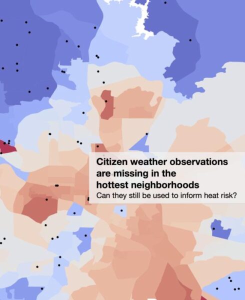
The researchers hypothesized that the poorest, hottest areas of a city don’t have nearly as many personal weather stations — if they even have any at all. To address this problem, there are two possible solutions: either install more weather stations or figure out a way to correct for the lack of data.
Statistics to the rescue.
Working with David Carlson, assistant professor of civil and environmental engineering at Duke, the group pulled four years of data for the entire state of North Carolina from Weather Underground’s servers. They then mapped out where those stations are set up and compared their numbers to each area’s median income.
Unsurprisingly, there was a strong correlation between income and data, with more stations being set up in areas with higher median incomes. The researchers then did some statistical gymnastics and applied that same correlation to their trove of temperature data.
“This was a clever trick that Zach thought of to generate more accurate heat readings,” said Carlson. “But then there was the question of whether or not this correction actually creates more realistic heat maps or not.”
To validate their approach, the researchers turned to the National Integrated Heat Health Information System (NIHHIS). In 2021, the federal organization chose 15 locations for their NIHHIS-CAPA HeatWatch Campaign, where large groups of scientists and community volunteers took multiple heat and humidity readings throughout a single day across entire cities. Fortunately, both Raleigh and Durham, North Carolina were part of the project.
The team took Weather Underground’s readings for Durham on that same 2021 day and applied their statistical correction across the city. They found that their results across the entire city — and, most importantly, in the areas with few or no personal weather station data — were much closer to the HeatWatch campaign’s data.
These were also some of the hottest parts of the city, with temperatures exceeding what Weather Underground and The Weather Channel reported.
“Our work shows that you can make corrections and get better estimates of urban heat islands through these types of methods,” said Carlson. “It also highlights the need for additional weather stations so we’re aware of just how much hotter the summer is for the poorest members of our community.”
This research was supported through a collaboration with the Underwriter’s Laboratory (UL).
CITATION: “Refining Citizen Climate Science: Addressing Preferential Sampling for Improved Estimates of Urban Heat,” Zachary D. Calhoun, Marilyn S. Black, Mike Bergin, and David Carlson. Environmental Science and Technology Letters, June 17, 2024. DOI: 10.1021/acs.estlett.4c00296


