Truth was the first casualty in the war on COVID. Trusted sources of medical information became propaganda outlets, and when that wasn’t enough, the raw data on which medical analysis was based was withheld and even falsified by the governments that controlled it.
Hence, it’s refreshing to see an honest analysis of apparently honest government data. The analysis comes from Christof Kuhbandner and Matthias Reitzner, professors of sociology and mathematics, respectively, at two German universities. The data is from the German Federal Statistical Office (Bundesamt für Statistik). I’m grateful to a fellow Substacker who writes under the pseudonym Eugyppius for calling my attention to this article and placing it in context.
Of course, what we would like to have is a count of deaths and hospitalizations due to COVID and corresponding counts for deaths and hospitalizations due to the vaccines. This data has been disguised or deleted by governments around the world. The very definitions of causality have been gamed for these two cases.
Draw your own conclusions.
But data on all-cause mortality are more difficult to disguise or to reinterpret, as our two authors are quick to point out. This is a simple list of people who died, together with their age and sex, and no overlaid story about how they met their demise. The point is that we can find patterns in this data that hold implications for COVID epidemiology and COVID policy.
Take-home message
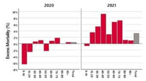
Here’s the bottom line: In 2020, we see a slight excess of death in the oldest age group, too small to be significant. In 2021, we see a large excess of death in middle-aged people.
My interpretation agrees with Eugyppius (though the authors of the academic paper are sticking to “just the facts, Ma’am”). My interpretation is that COVID in its first wave (2020) killed mostly people who were already old, and they died earlier than they would have, had it not been for COVID. Vaccine adverse reactions (2021) caused death across a broader range of ages, but we see the signature most prominently in the middle ages. This is because
- The old people who were most vulnerable were already dead from COVID before the vaccines were rolled out.
- Old people’s immune systems are less active, and they are less likely to overreact to the vaccines in fatal ways.
- Among healthy middle-aged people, the baseline death rates are quite low, so that the vaccine’s contribution to mortality expressed as a percentage sticks out more prominently, even though the absolute numbers are not as large as the count of old people killed by the vaccines.
Governments and their mouthpieces in the media would like to attribute the 2021 excess deaths to COVID, but we know that COVID deaths are heavily concentrated in the oldest age range, and what happened in 2021 did not fit that pattern.
Details
I recommend the journal article as exceptionally readable and even-handed. The authors review other analyses of patterns in all-cause mortality. They point out that we are interested in departures from past trends, but there is no way to define those trends objectively. There are four moving parts to be accounted:
- Overall population is increasing
- Overall death rates are decreasing
- The proportions of the population in each age group are changing
- The mortality rates of these different subpopulations were already changing before COVID
The authors both acknowledge the strengths of previous analyses and note the places where one or more of these four adjustments were not part of the calculation. They then proceed to their own analysis, based on actuarial tables. You may already be familiar with how actuarial tables work. They are used to calculate insurance risk, and typically they list probabilities of death for a one-year period, based on age, sex, and sometimes race.
(Insurance companies are motivated to make a profit, and they don’t mess around with fudge factors. That’s why it was so alarming when a number of insurance companies announced earlier this year that their group life policies had paid out higher benefits in the last half of 2021 at an unprecedented level.)
The authors track the trends in actuarial tables from the past several years and use them to construct tables for Germany in 2020 and 2021. They combine these with census data for the number of Germans in each age group to create their estimates of how the actual number of deaths differed from expectations. That is the methodology that went into the graph above.
The database they use also includes dates for each death. The authors were able to track when in time the excess deaths among 30-79 year-olds occurred. The answer: The excess deaths began in April 2021 and continued through most of the year. Deaths for the age range 60-79 were up 20%, April 2021 thru March 2022*.
Except for one understated paragraph, the authors never use the word “vaccine”, but they leave us with their inference that something nasty happened in April, 2021.
Draw your own conclusions.
A simpler approach
Most of the effort and the technical detail in the article is devoted to defining an expected mortality rate for each age group. But for what we want to know, this is largely unnecessary if we simply compare 2020 with 2021.
2020 — this is what mortality looks like with COVID
2021 — this is what mortality looks like with COVID + vaccines
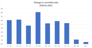
In every age group, mortality was higher in the year of the vaccine. Isn’t that all we really need to know?
Here’s the corresponding graph, computed with CDC data for the USA:
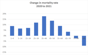
The US data tell us that older Americans may have benefited from the vaccines in 2021, but for everyone under the age of 75, their risk of dying in the year of the vaccine was higher than in the year of COVID. The difference was quite substantial, but not in the 40% range suggested by the insurance data.
————
Footnote
* If you’re reading very carefully, you may have noticed that deaths for employment-age people were up 5 to 10% according to the graph, but the referenced insurance report says that life insurance payouts were up 40%. Where does the difference come from? The honest answer is that I don’t know, but here are two suggestions that might be partially responsible.
- The US is more heavily vaccinated than Germany, currently 88% vs 78% have received at least one dose.
- People who are employed by companies large enough to have group life insurance policies are a healthy slice of the population. Those most at risk of death are less likely to be employed. This means that group life insurance risks are lower than personal risks, so the baseline is low for these group policies, and the percent change correspondingly greater. Vaccine deaths seem to be an equal opportunity assassin, and completely healthy people are reported to drop dead in their tracks.
If our reporting has informed or inspired you, please consider making a donation. Every contribution, no matter the size, empowers us to continue delivering accurate, engaging, and trustworthy science and medical news. Independent journalism requires time, effort, and resources—your support ensures we can keep uncovering the stories that matter most to you.
Join us in making knowledge accessible and impactful. Thank you for standing with us!