The violinist steps onto the stage of a deep-crimson concert hall, bow poised, and something shifts — not in the acoustics, but in your head. A new study from Berlin’s Technical University suggests that what you see really does change what you hear; that the colour painted on a concert hall’s walls seeps, rather unexpectedly, into your perception of the music itself.
Specifically, it changes how warm the sound seems to you. Saturated blues and greens made the same musical performance feel sonically colder to participants, while darker, less intensely coloured halls earned higher enjoyment scores overall.
The effect emerges from a curious collision of senses. Stefan Weinzierl, an acoustician at TU Berlin, put it plainly: “Room acoustics perception is multidimensional. We perceive halls as more reverberant or less reverberant; we perceive them as louder or softer, but we also perceive different timbres of a hall — a hall can appear warm, or it can appear bright or metallic in sound.” The question, until now, was whether the walls could nudge that dial. Turns out, they can — though not in the ways you might expect.
Loudness wasn’t affected. Neither was reverberance. Those qualities, it seems, resist visual interference.
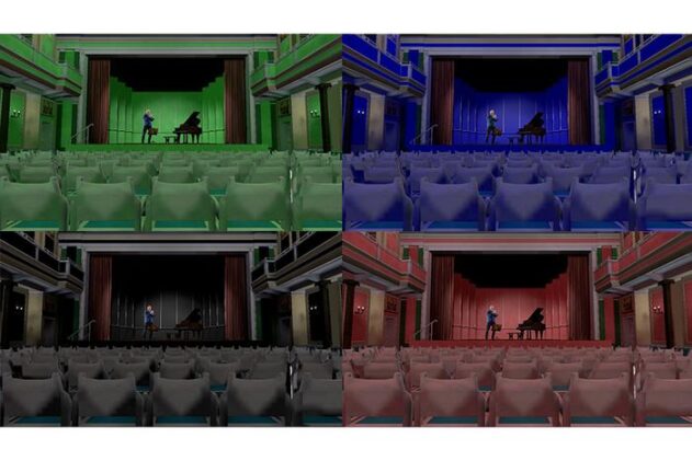
To test this, Weinzierl and colleagues Christos Drouzas and Jochen Steffens recruited 48 participants and plunged them into virtual reality — a meticulous digital replica of the Konzerthaus Berlin’s small chamber hall, rendered in 12 different colour schemes spanning red, green, and blue at varying levels of brightness and saturation. The performances inside (Bach on violin, contemporary clarinet pieces) were motion-tracked recordings convolved with binaural room impulse responses, adjusting dynamically as participants turned their heads. Proper immersive stuff.
Participants rated what they heard against eight acoustic attributes including warmth, brilliance, clarity, and metallicness. The results for warmth were clear and statistically robust, with more saturated colours producing consistently cooler perceived sound.
The likely explanation is semantic, perhaps a bit strange-sounding at first. We use the word “warm” to describe a visual colour, a physical temperature, and an acoustic timbre — and the brain, apparently, doesn’t always keep these categories tidy. When you’re sitting in a vibrant blue hall and consciously trying to assess the acoustic warmth of the music, the visual “coolness” of your surroundings may be quietly contaminating that judgement. Weinzierl’s team calls this a “semantically mediated cross-modal interaction,” and the more musically experienced participants were, the stronger the effect tended to be. Musicians and regular concert-goers seem to have developed, over years of exposure, richer sensory associations between how a space looks and how it ought to sound.
That moderation by musical experience is perhaps the most striking element of the whole business. Without accounting for listeners’ musical backgrounds, colour explained only about 5% of the variance in warmth perception. With it factored in, that figure climbed to nearly 14%. Hardly dramatic in absolute terms, but enough to matter when you’re spending millions on a performance space.
Weinzierl is measured about the practical stakes. “Considering the effort that is done to improve acoustical properties — all the money that is spent for making a concert hall sound well — I think it should not be overlooked that the visual appearance makes its contribution to the sound of the hall.”
His message to architects is fairly direct: “If you design a concert hall, don’t forget to think about the visual appearance. It will have an effect on how the sound is perceived.”
Concert hall acousticians already agonise over the frequency-dependent absorption properties of seat upholstery, wall materials, and carpets. Whether a crimson curtain scatters differently from a blue one is well understood; whether its colour shifts your sense of the music’s timbre, apparently, has not been. This study suggests these two concerns — the physical and the perceptual — might be less separable than they looked.
The next step is probably to test real halls rather than virtual ones, and across a wider range of musical genres and listener backgrounds. But for now, the old assumption that concert hall colour is merely decorative looks rather harder to defend.
Study link: https://pubs.aip.org/asa/jasa/article/159/2/1674/3380889/The-influence-of-the-color-design-of-auditoriums
ScienceBlog.com has no paywalls, no sponsored content, and no agenda beyond getting the science right. Every story here is written to inform, not to impress an advertiser or push a point of view.
Good science journalism takes time — reading the papers, checking the claims, finding researchers who can put findings in context. We do that work because we think it matters.
If you find this site useful, consider supporting it with a donation. Even a few dollars a month helps keep the coverage independent and free for everyone.